- Overview



- Mission statement
- Our mission is to help residents of underserved communities worldwide make better use of their resources in emergency medical situations by providing them with technologies through software programming.
- Problem
- The red cross in Tijuana has limited resources. They must deal with outdated and highly unreliable technologies (radio, satellite) that come with large costs. They have only 13 ambulances for almost 2 million people, boiling down to 1 ambulance for every 150,000 people. As a result, the time it takes for an ambulance to attend to a patient and deliver them to a hospital often can go from 30 minutes up to over an hour.
- Solution
- By providing a software interface to allow dispatchers to visualize ambulances in real time, communicate directly with ambulance drivers/hospital employees, and dispatch ambulances more effectively, we can help them optimize resource usage.
- Our software consists of two main components:
The first component involves a mobile application for tablets installed in all ambulances within Tijuana. The mobile application will be used by EMTs and ambulance drivers to track ambulance location, perform routing, and accept dispatching calls.
The second component is a website dispatcher interface. With this tool, dispatchers can visualize the locations of all ambulances on a map, check their status, and dispatch them to areas of emergency. In addition, our software will help Cruz Roja determine the optimal placement of ambulances, compute most effective routes, and analyze the results of the dispatching process.
Redesigning the Call Module
Understanding the Workflow
The "call" here refers to the assignment of patient-pickup task to an ambulance driver. By clicking on "New Call", the dispatcher assigns a "call" to a driver along with the patient's information (e.g. age, location, and emergency level). After the driver accepts the call, it will be listed below the "Calls" in the old UI or "Calls In Progress" in the new UI. Then, the dispatcher will be able to track the real-time location and mission progress of the driver.
Identifying UI problems
Call module display on dispatcher's end

1. There are some idle elements such as the blue count boxes, checkboxes, and the cross right to the information icon (i).
2. The information icon (i) is not noticeable enough because of its small size, and because its location in the middle of a cluster of elements.
Entering patient info page through the (i) icon
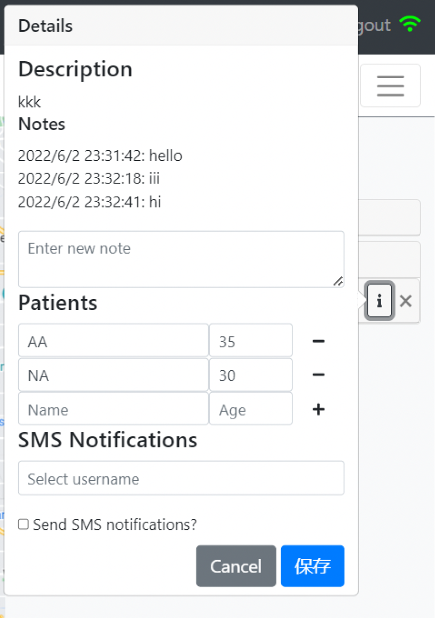
1. Messages between the dispatcher and the driver are displayed as static entries. When the dialogue grows longer, the popup window will also grow with no restraint.
2. There is no sender identification, so it is mentally demanding to distinguish each other.
3. The progress of caller's ambulance could be a crucial information to be displayed side to side when communicating with the driver, but it is not included here.
Solutions
Call module display on dispatcher's end
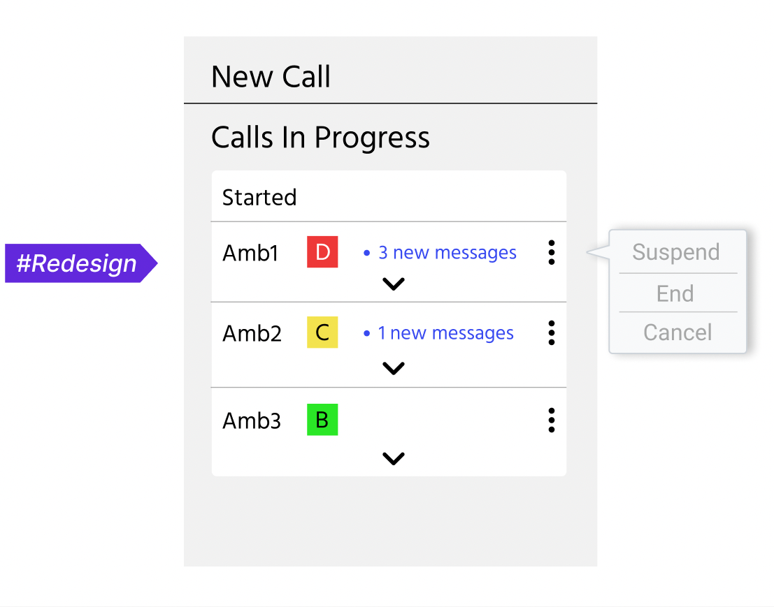
Icon cleanup and replacement: unnecessary elements such as the blue count boxes and checkboxes are removed.
Each bar of the call is now expandable, displaying all details on a drop down window rather than a pop-up window by clicking on the i icon.
A three-dot button is added to capture any operation that applies to the entire call rather than part of the call.
Entering patient info page through the i icon
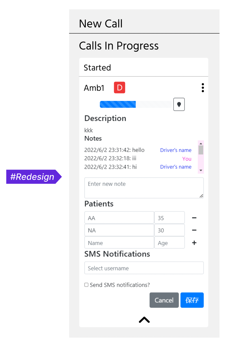
An intuitive way to redesign it may be mimicing how mobile messaging apps display a conversation. However, considering the limited space in our interface, the chat dialogue needs to be displayed in a compact way. Therefore, instead of being shown in bubbles like how the mobile app did it, the messages are reorganized to simple, diary-like entries but with a scroll bar.
Additionally, the sender’s name will be shown on the right hand side of each text message, distinguished by colors.
Redesign Summary
- Messaging system
- Replaced the diary-style chat display on web application with a continuously updating and interactive chat interface.
Integrated autocomplete and smart suggestions into the diary and log modules. - Notification system
- Embedded notification feature to web application and expand the features that mobile app notification system covers.Icon cleanup and replacementReplace non-intuitive icons and adjust their layout/grouping.
- Icon cleanup and replacement
- Replace non-intuitive icons and adjust their layout/grouping.
- Itinerary tracking module
- Redesigned the visualization to display all routes and status of vehicles instantly after opening the left-side menu without extra manipulation.