Mission
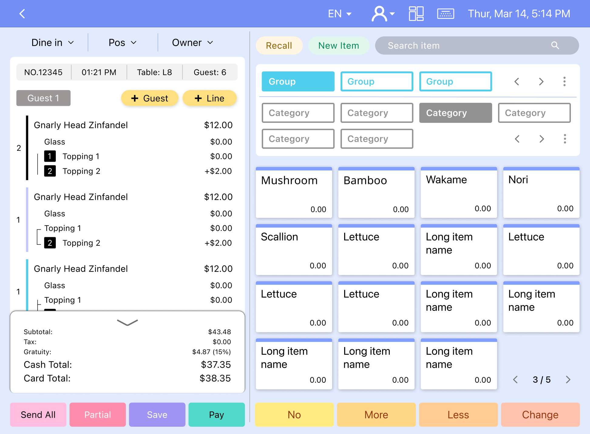
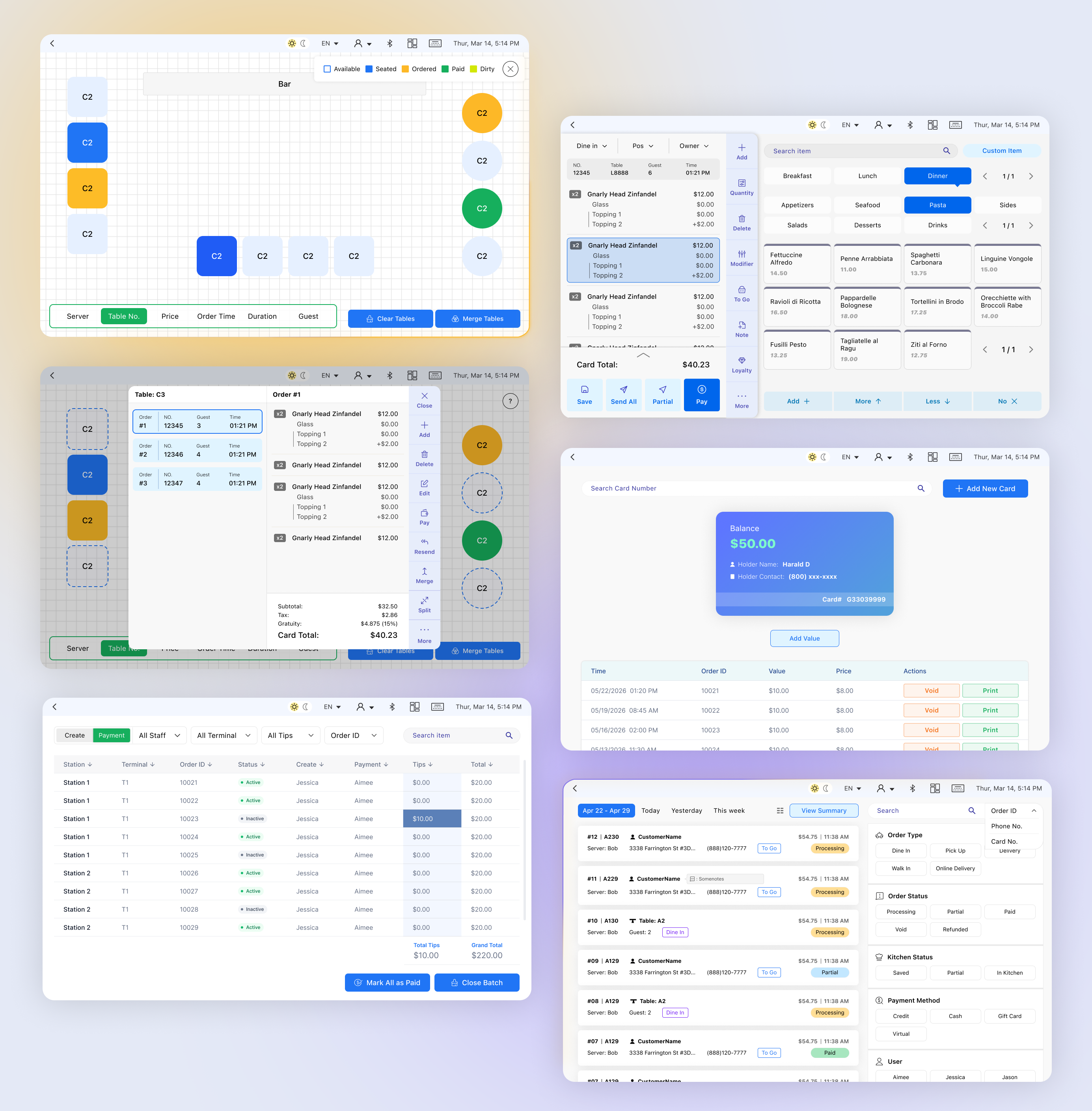
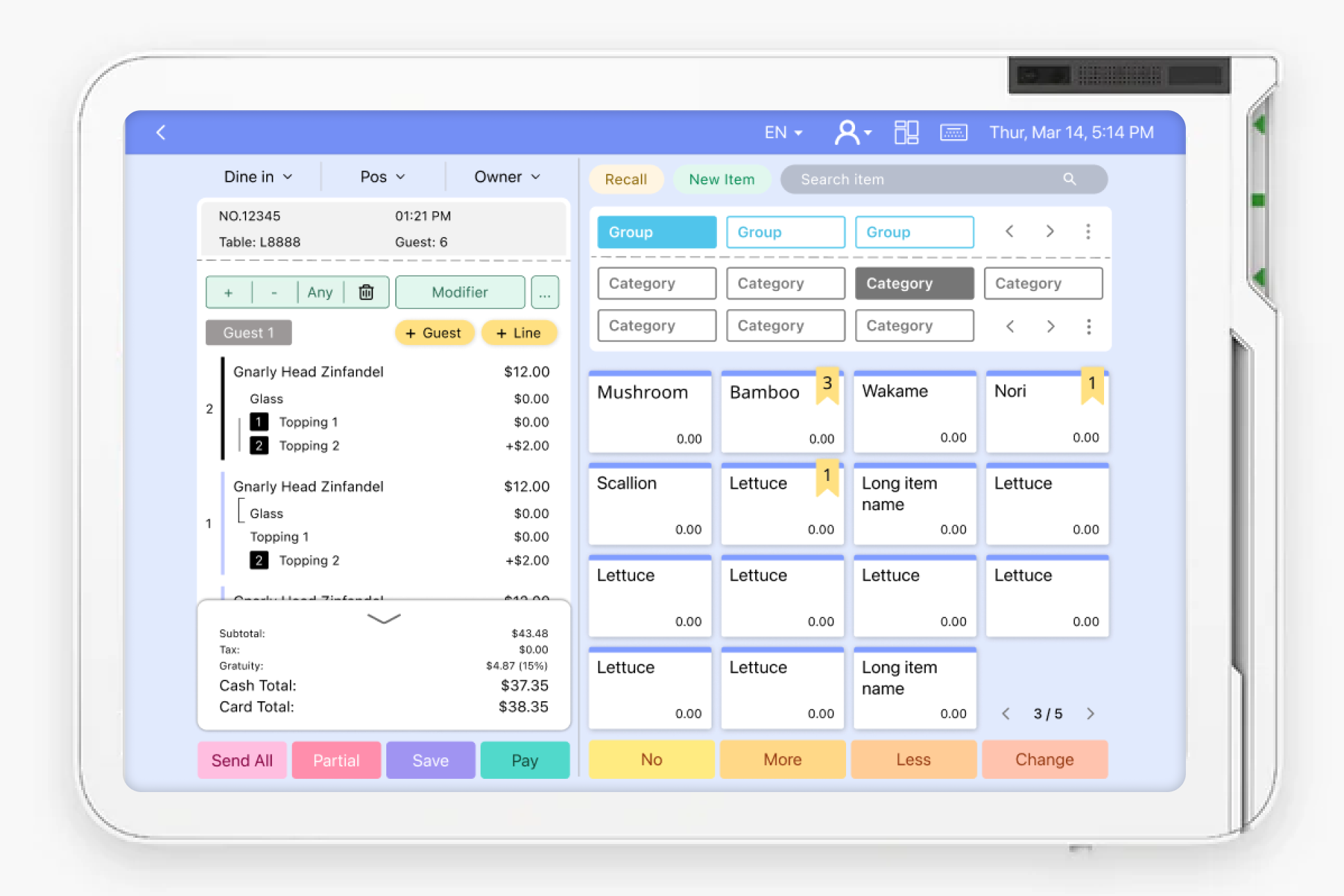
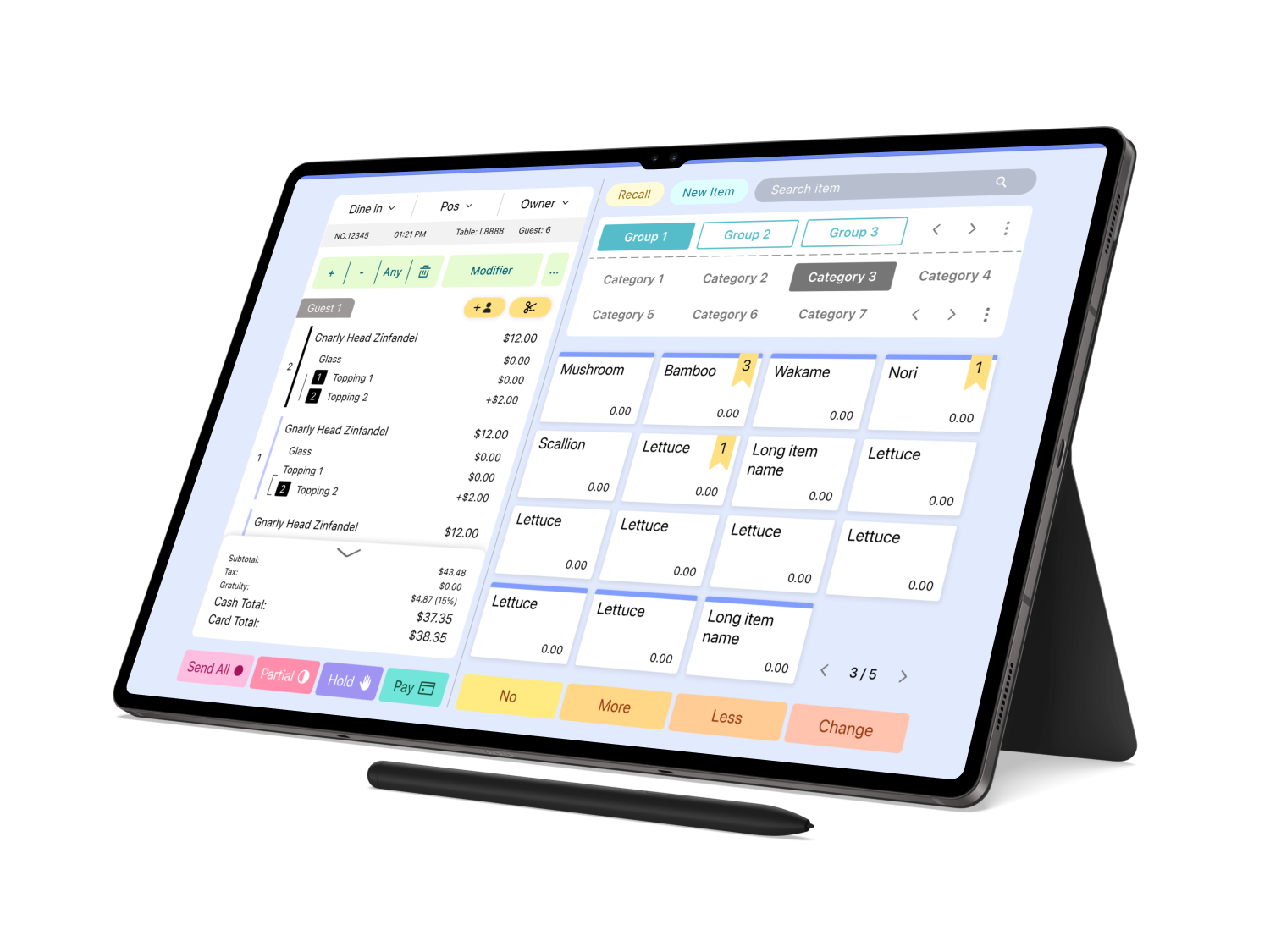
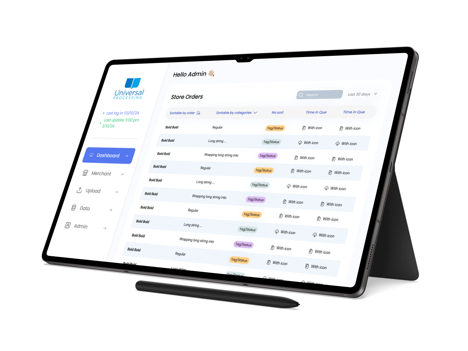
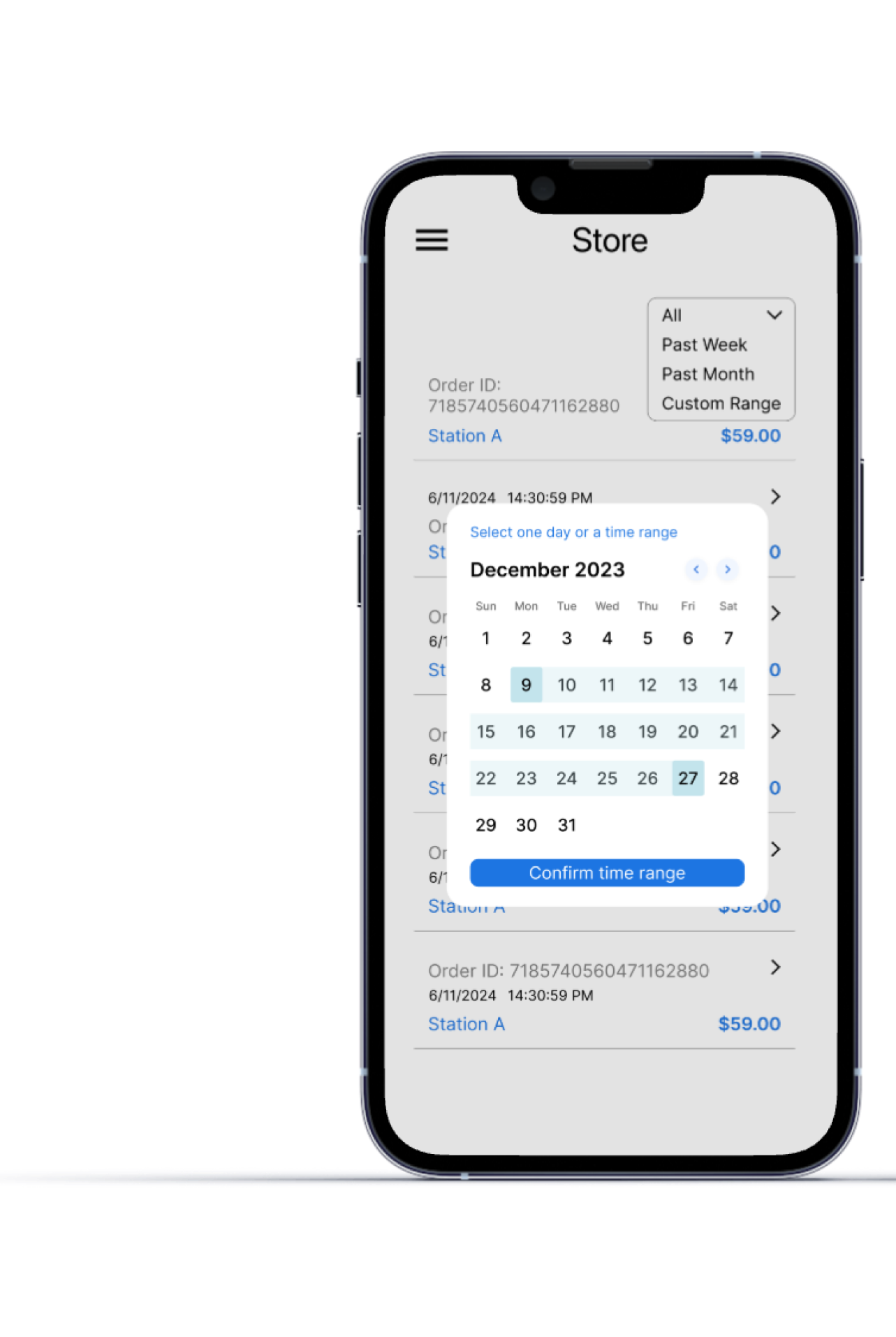
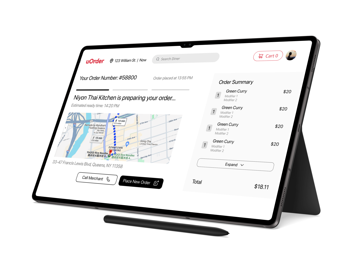
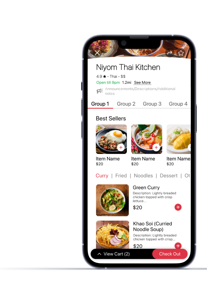
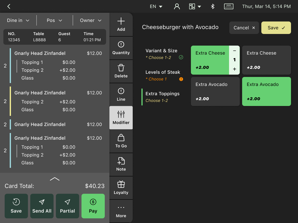
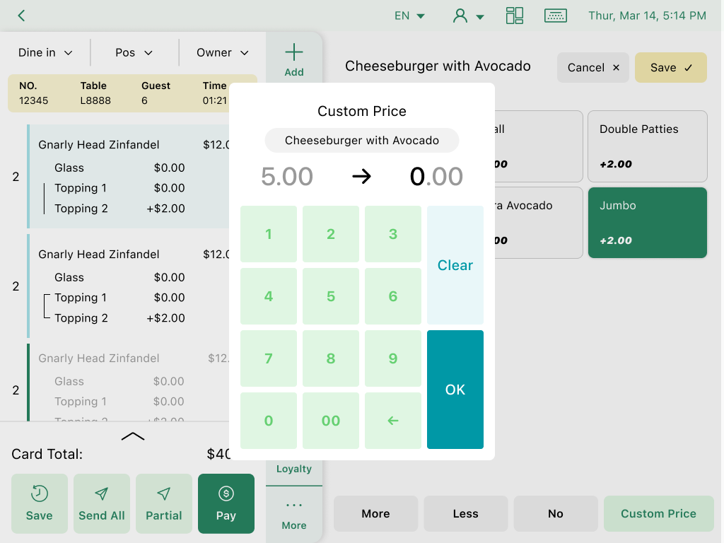
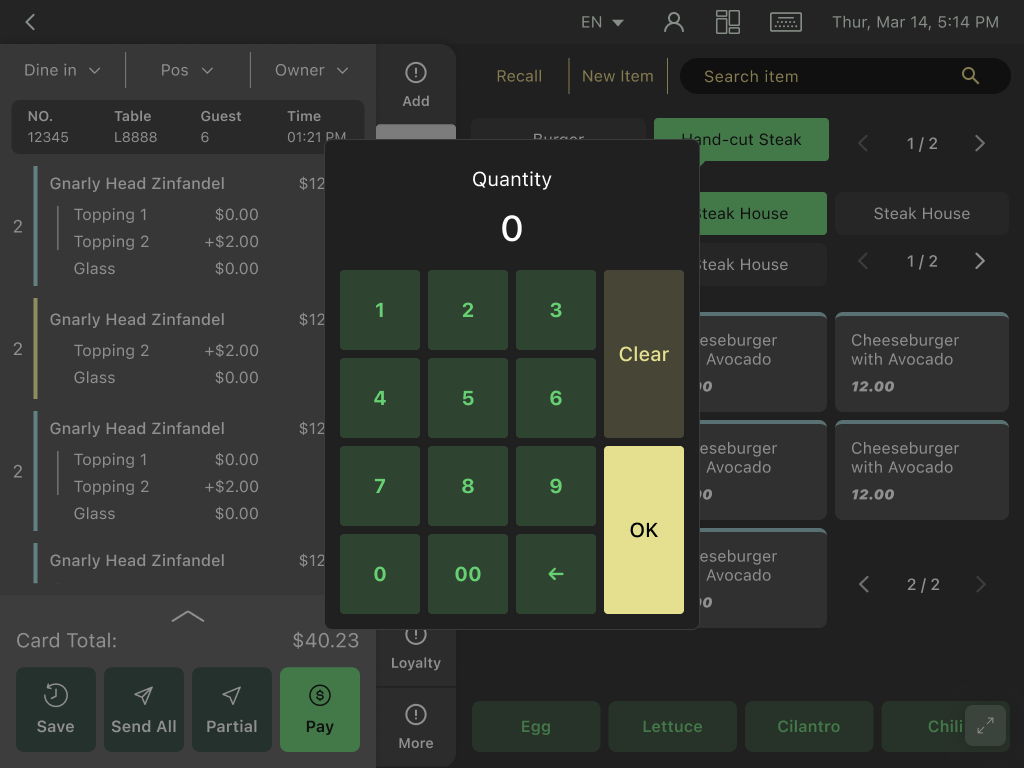
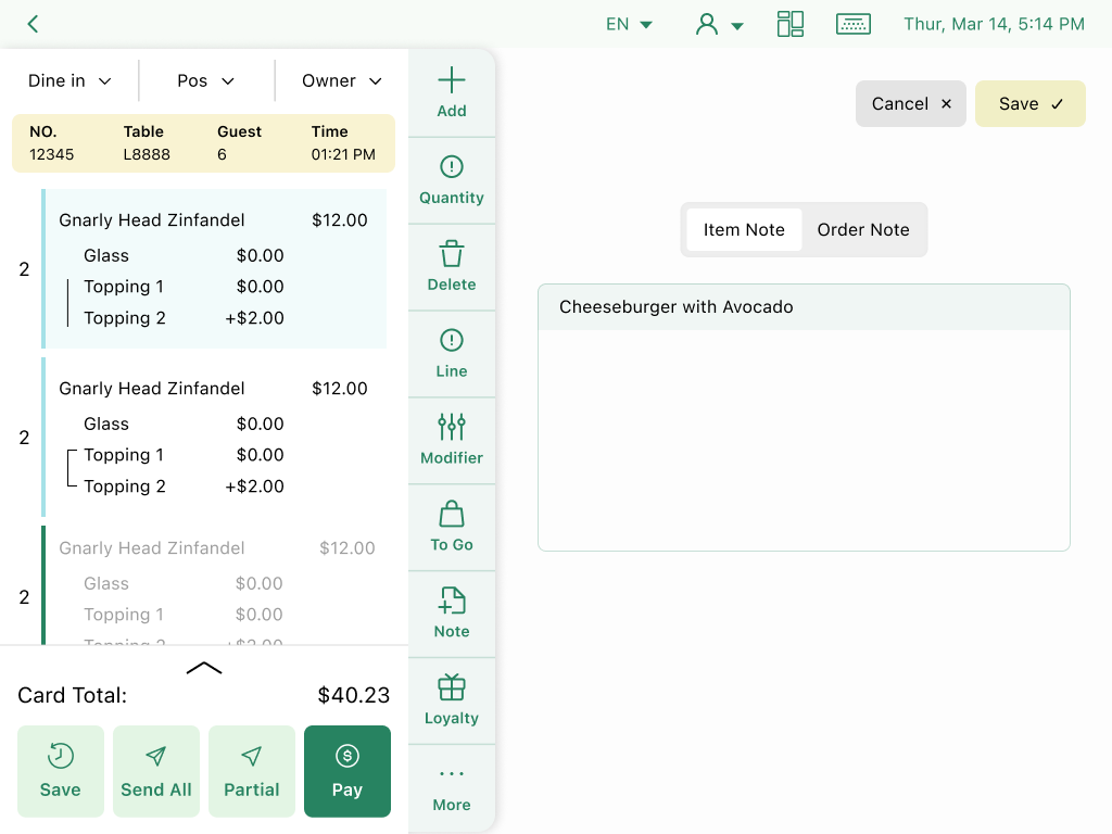
My mission is to rebrand, modernize, and lower both the learning and re-learning cost of the U Serve interface. POS interfaces are conventionally text-dense and have a flat information architecture. The goal is to achieve a balance between aesthetics and functional efficiency, ensuring a smooth transition for all users.
Problem Analysis
Problem Identification
Frequent user errors and lack of UI support for troubleshooting.
Problem Identification
Steep learning curves. Takes 1+ month for an untrained waitstaff to learn the system
Problem Identification
The outdated UI made prospects often question the POS system’s quality before even trying it
Root Cause Analysis
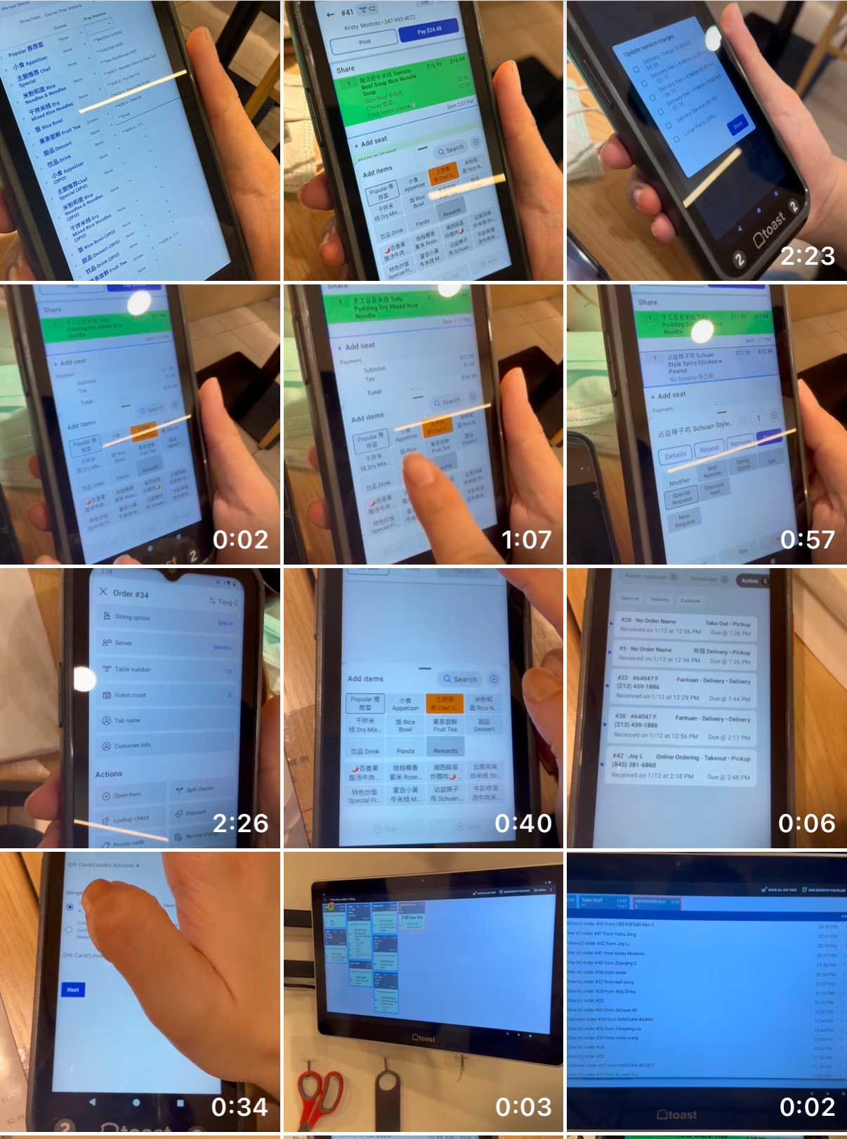
Overlooked hardware limitations, such as the communication protocols between devices, screen sensitivity and latency.
Root Cause Analysis
The old structure is a patchwork system
-- reactive fixes instead of cohesive design.
This led to messy information structures, nonintuitive and lengthy user flows.
Root Cause Analysis
Lack of consistency and brand identity; cramped layout; lack of visual hierarchy; rigid, sharp-edged, and flat UI components; heavy, dark color scheme
Stakeholder Research
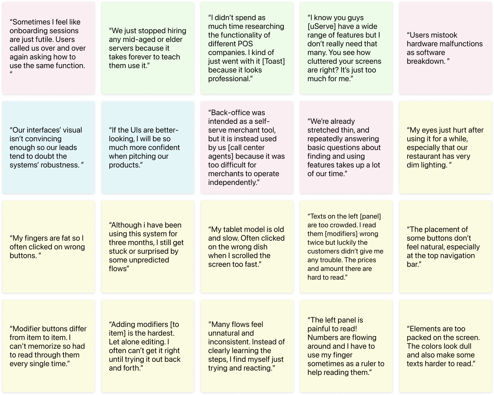
Interviews with sales team, restaurant waiters, and restaurant owners
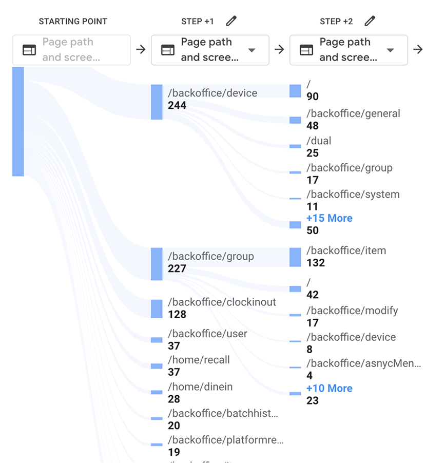
Tracking user data through Google Analytics
Field study, contextual inquiries & usability testings
Solutions
First Let's Rebrand
Conversations with sales and business development teams highlighted that an unconvincing premium image was hindering market growth. Although resources were focused on technical upgrades, the powerful influence of visual design on trust and perception had been overlooked.
Based on this insight, I set a clear design goal: reposition the product as modern, mid-to-high-end–appropriate, and visually calm without sacrificing functionality. I conducted competitive analysis across comparable POS products to understand prevailing visual patterns and identify opportunities to differentiate our brand.
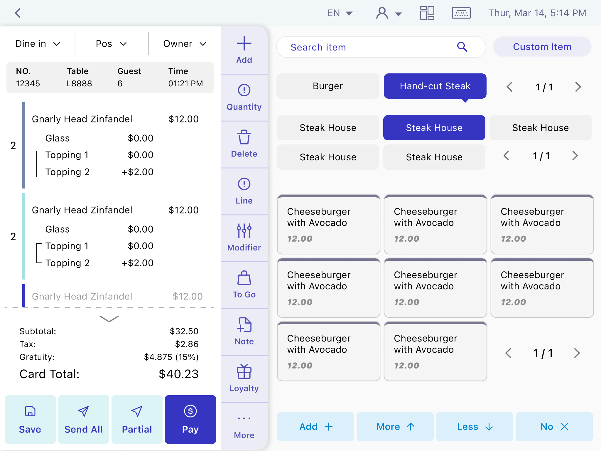
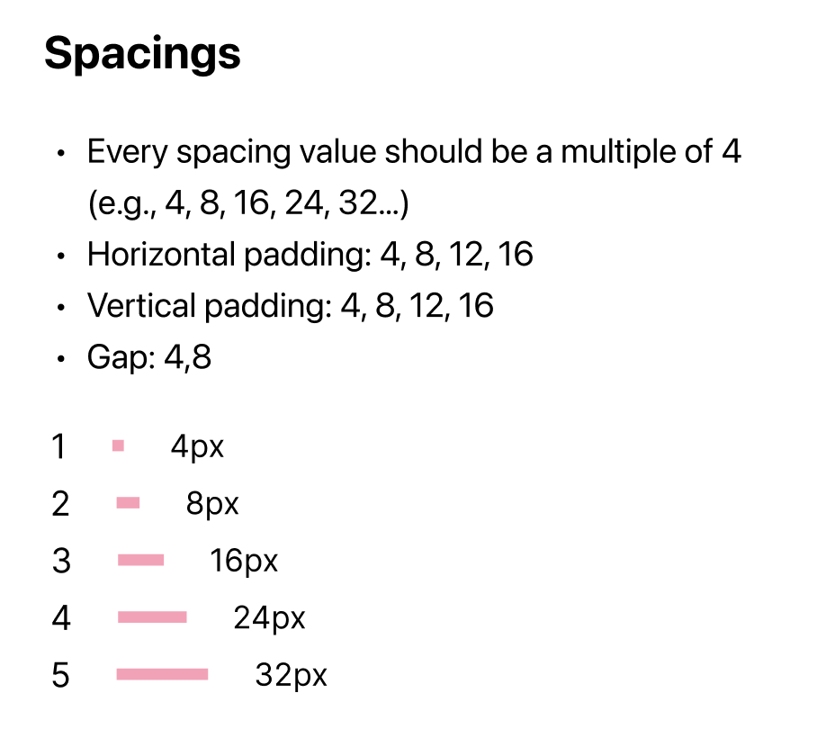
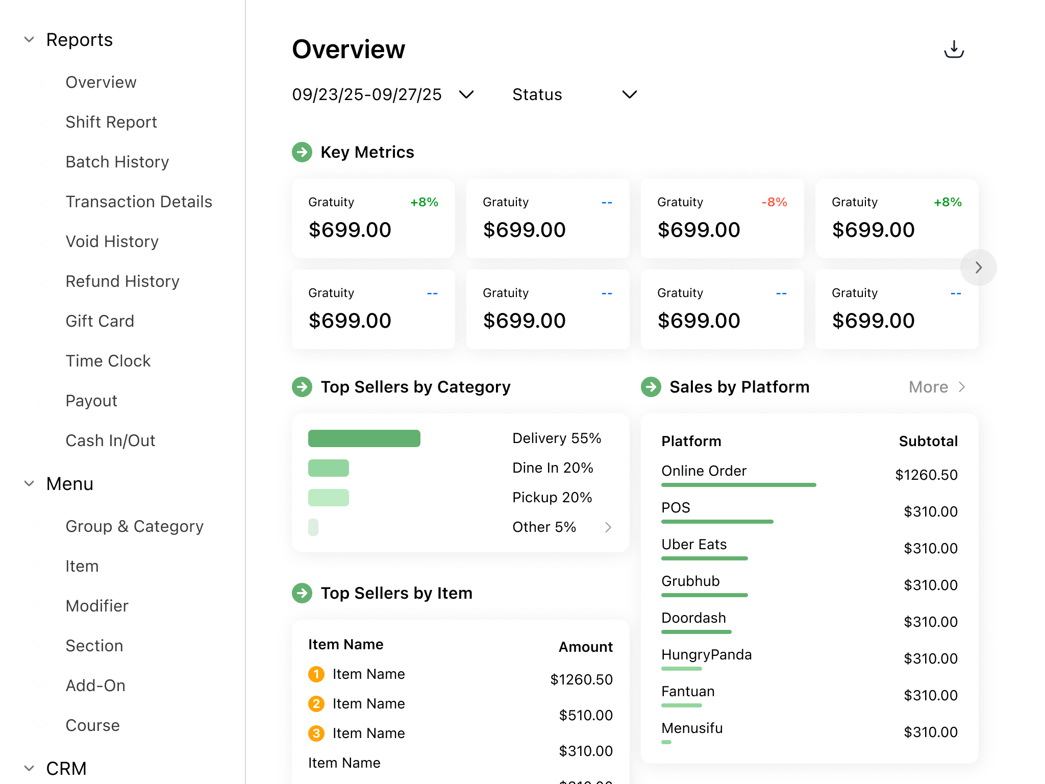
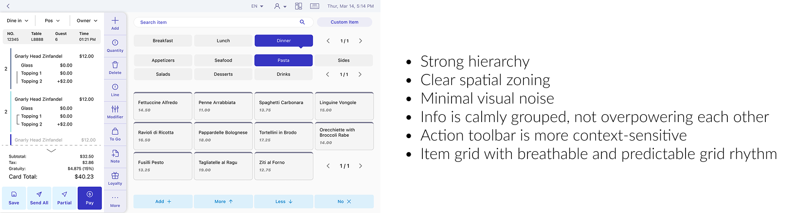
From there, I focused on improving scannability and learnability through stronger visual hierarchy, clear spatial zoning, and reduced visual noise. I also made actions more context-sensitive to avoid unnecessary UI clutter, and introduced a more breathable, predictable grid system for item layouts. Together, these changes modernized the look and feel while reinforcing clarity, trust, and accessibility.
Beyond “Ugly”: Understanding the Real Problem
Feedback from sales and users was loud but vague: “unprofessional,” “ugly,” “hurts my eyes.” To move beyond gut reactions, I dug into what was actually driving those perceptions. Visual aesthetics matter, but they’re only one piece of the overall experience.
By comparing our legacy interfaces with competitors that have similar functionality and strong market presence, I identified the root causes behind our lack of visual credibility and accessibility.
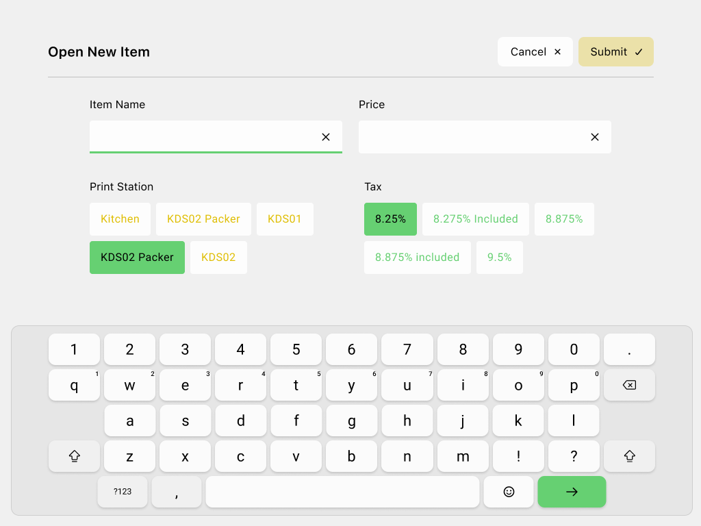
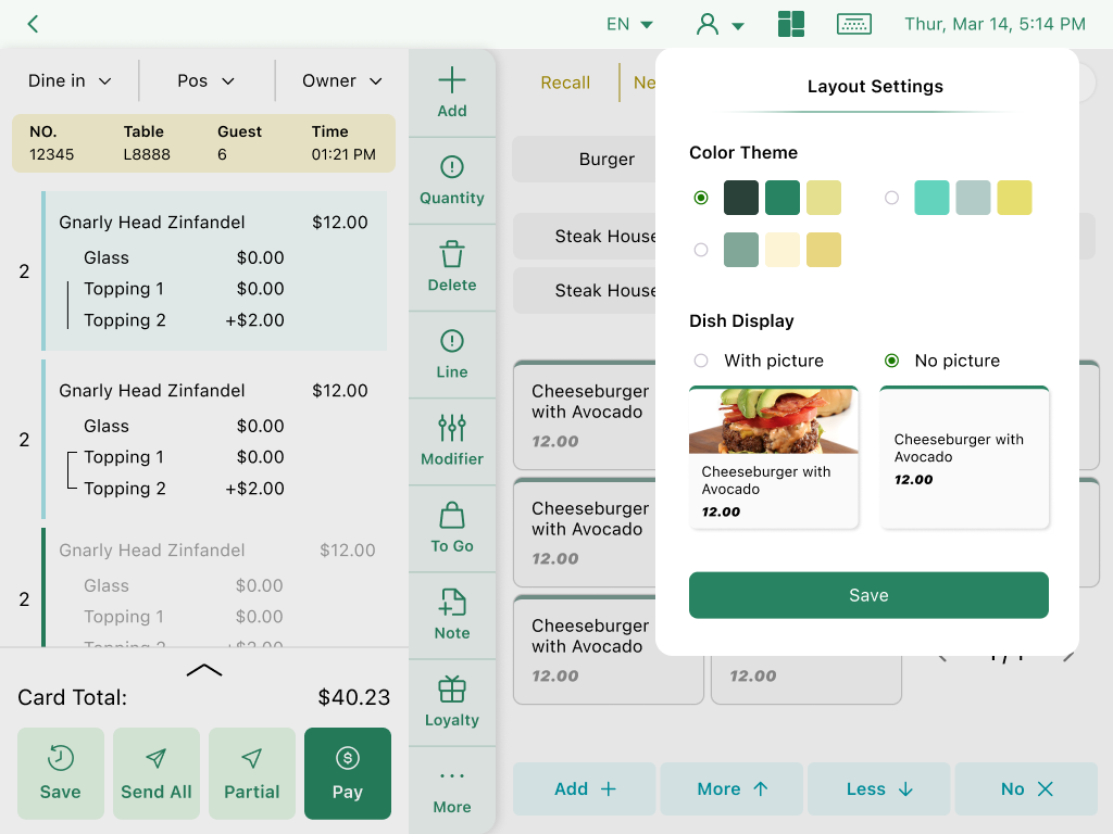
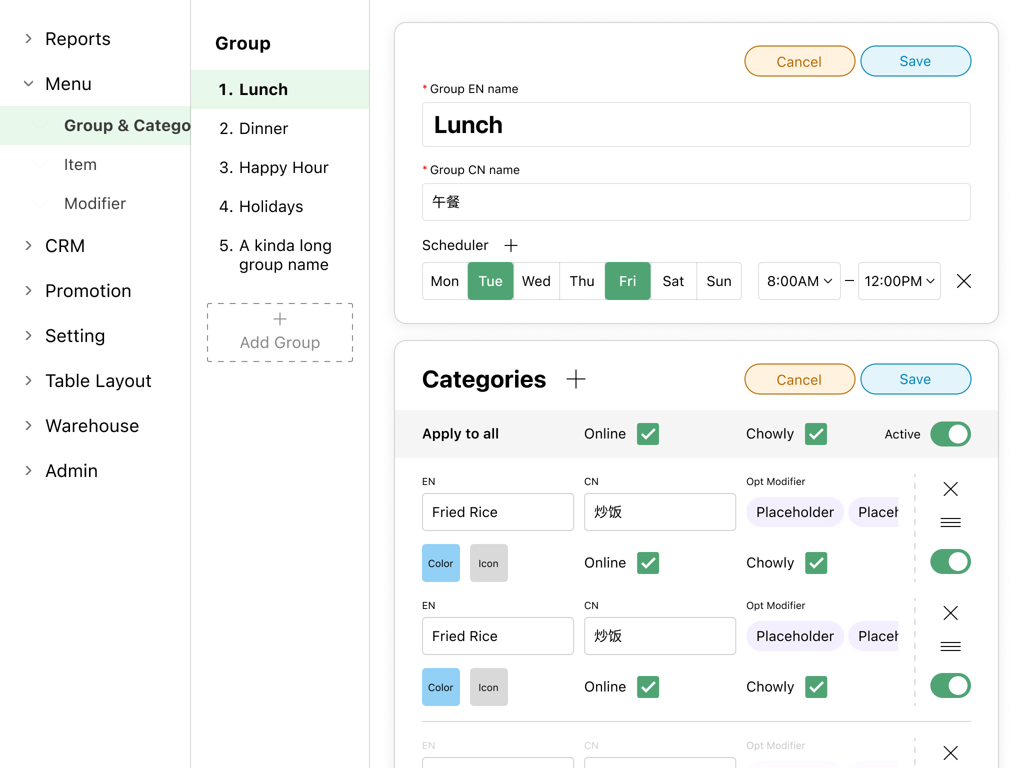
1. More customizability ≠ Good
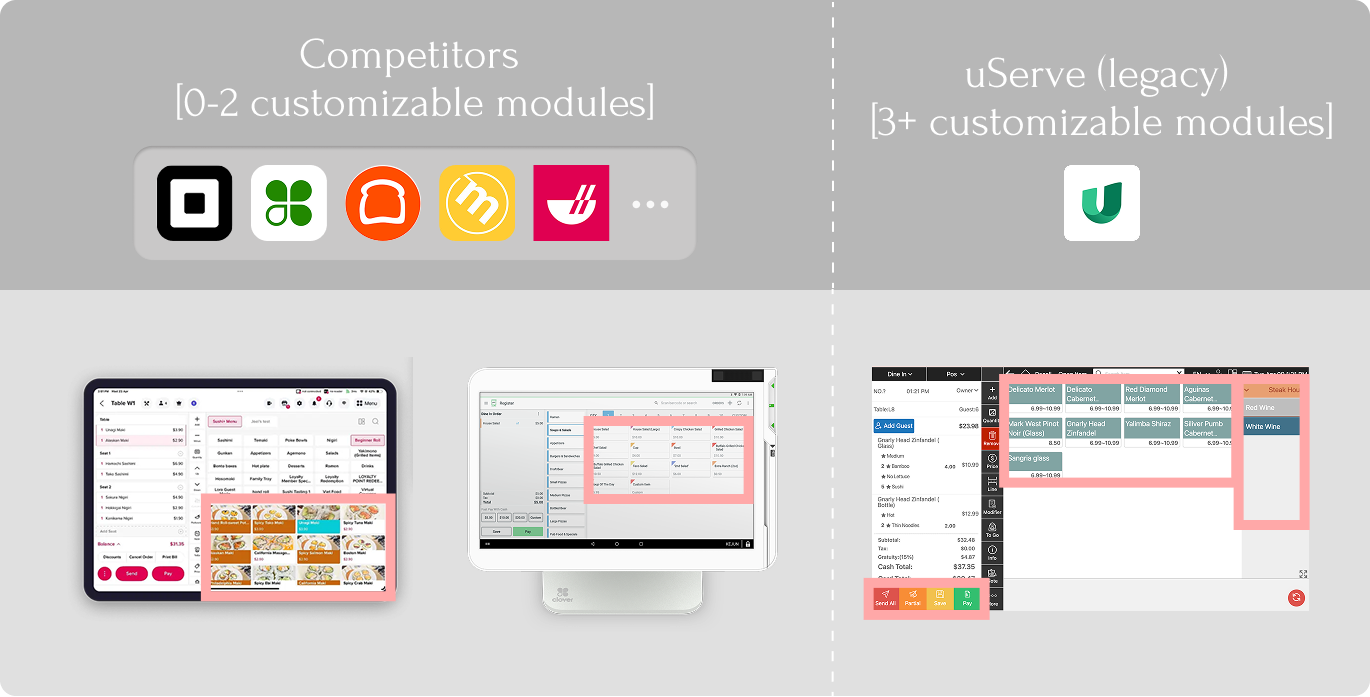
Due to the unique nature of POS systems, customization is necessary to support diverse visual learning styles and user scenarios.
However, excessive flexibility led to incoherent UIs and erosion of brand identity.
2. Overlooked physical constraints
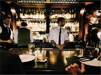
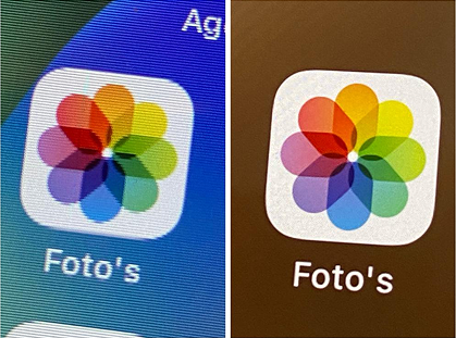
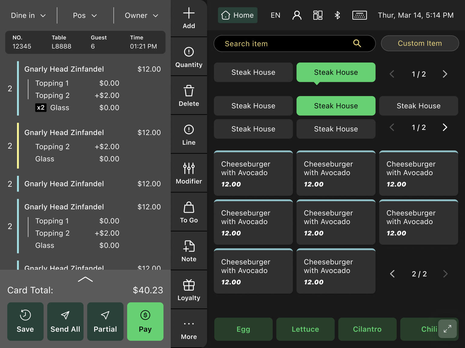
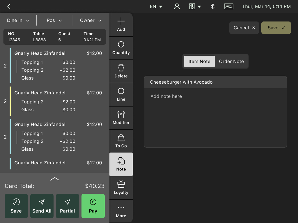
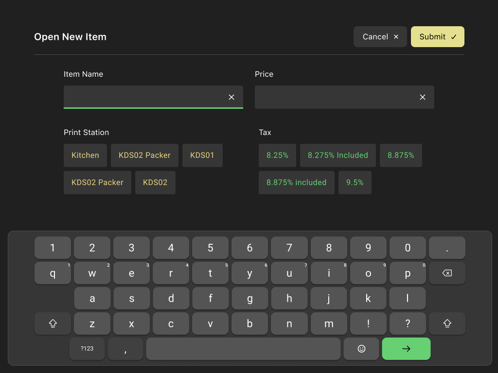
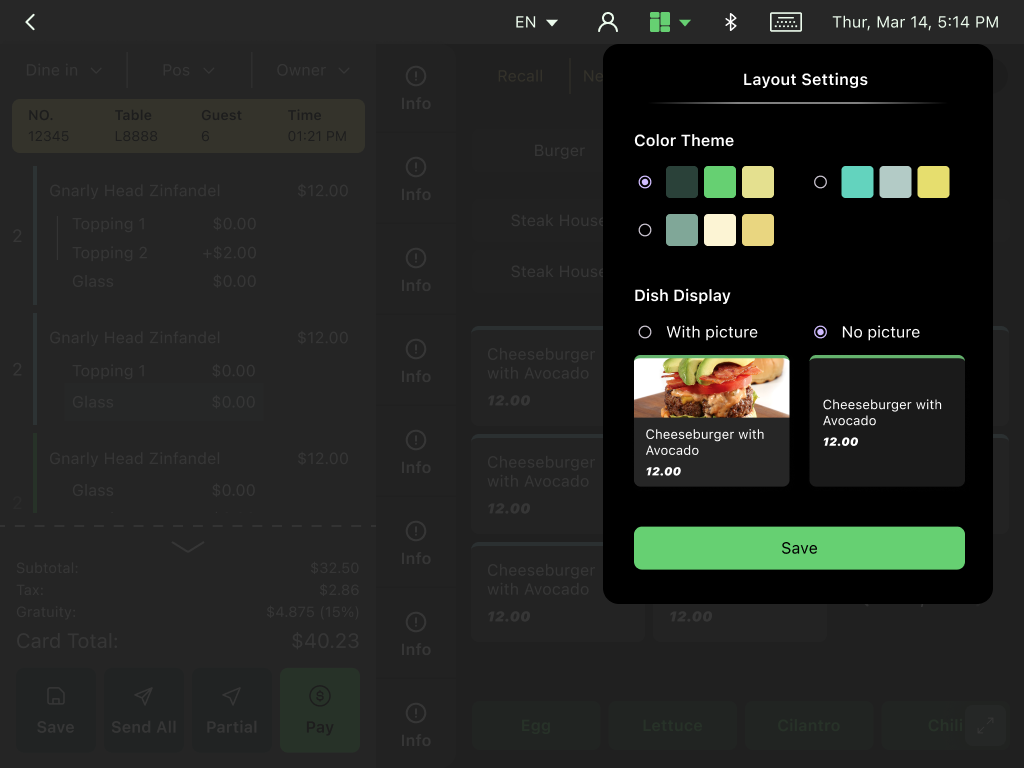
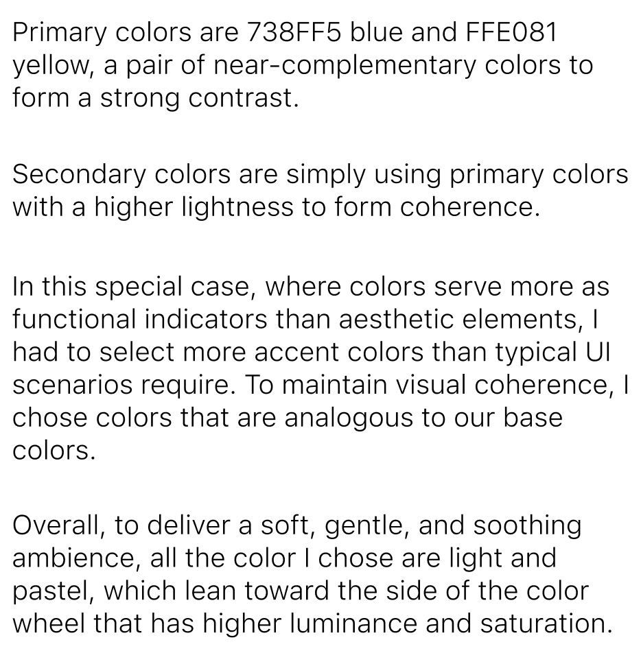
During field studies, I noticed that white-dominant interfaces can be glaring at restaurants with dim lightning. Also, many family-owned or ethnic restaurants use older models that have low resolution and poor color-rendering.


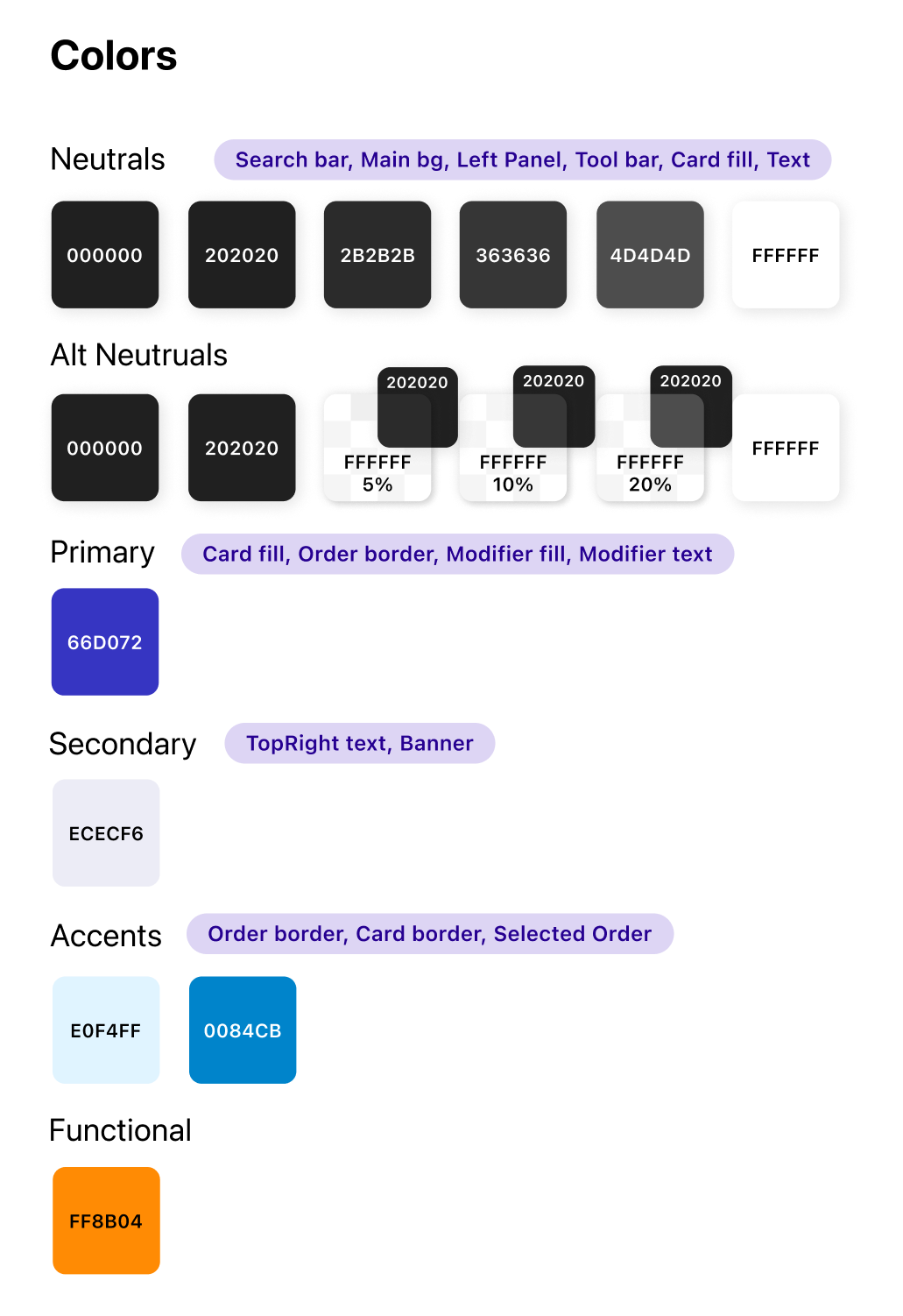
I iterated on dark-mode UI designs and tested them in real low-light restaurant settings on 1024×768 and 1366×768 hardware to calibrate color hue, saturation, and luminance for optimal accessibility and visual comfort.
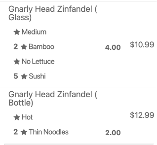
3. Messy visual hierarchy & Scope overlap
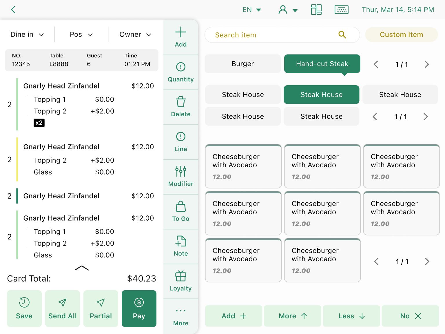
Old design 😵
New design 🥳
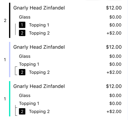
Higher visual importance on quantities

Clearer layer&grouping relationship
Consistent prices alignment
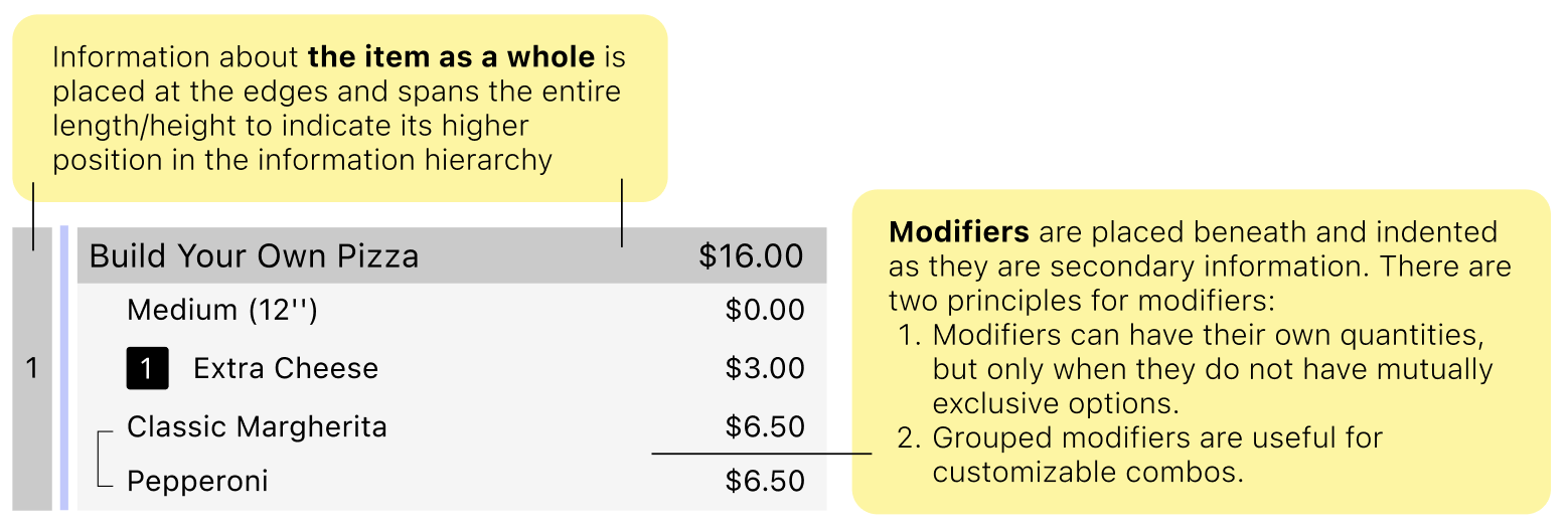

3 fill colors to indicate item status
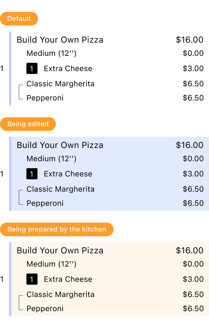
3 border colors to distinguish items


Clearer status change of items
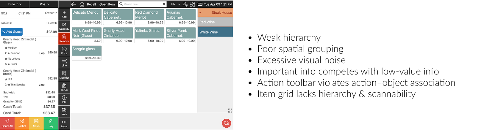
Before
After
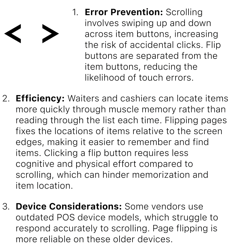
Efficiency optimization & Error provention
Why choose Page Flipping Over Scrolling / Swiping?
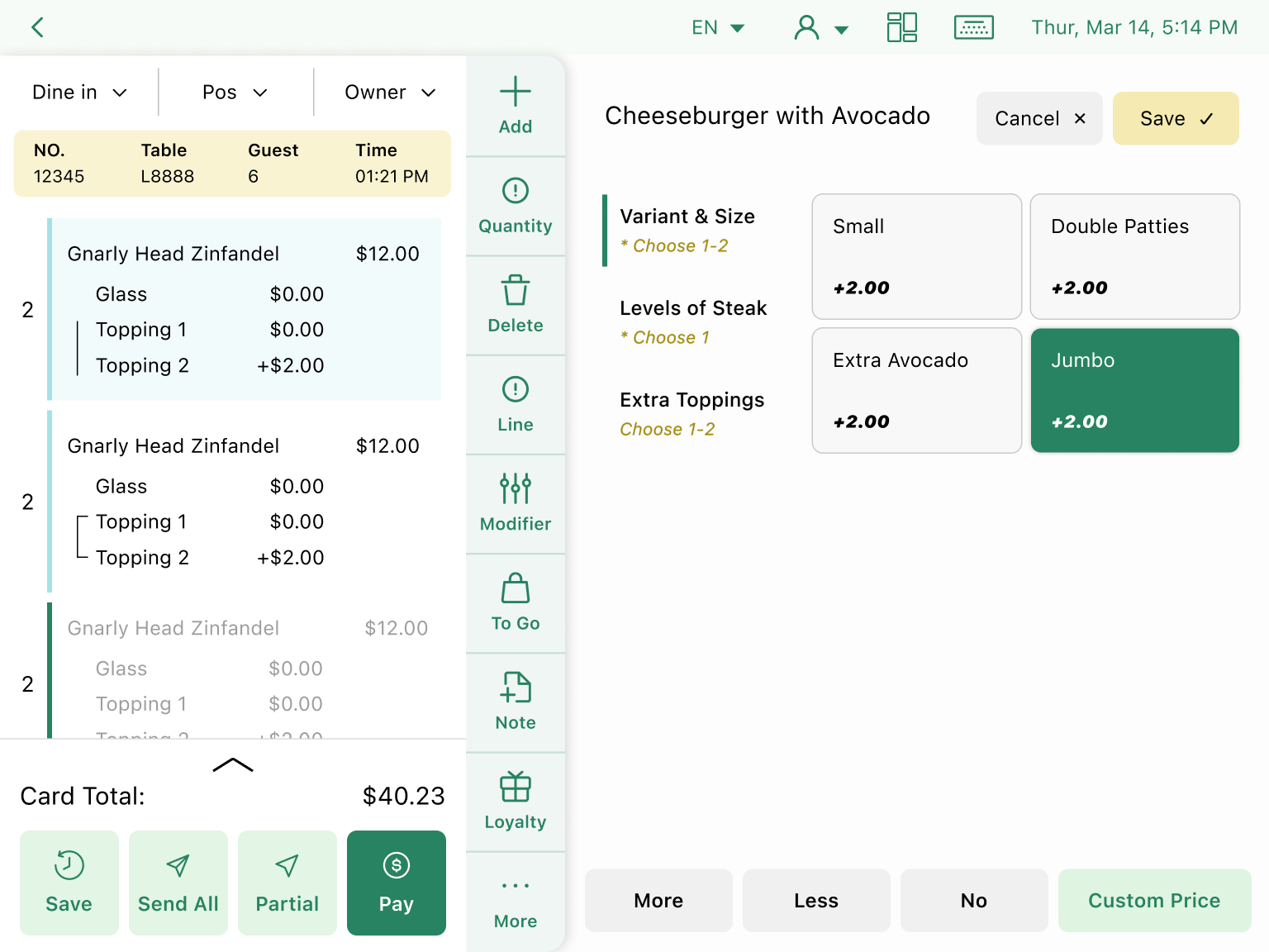
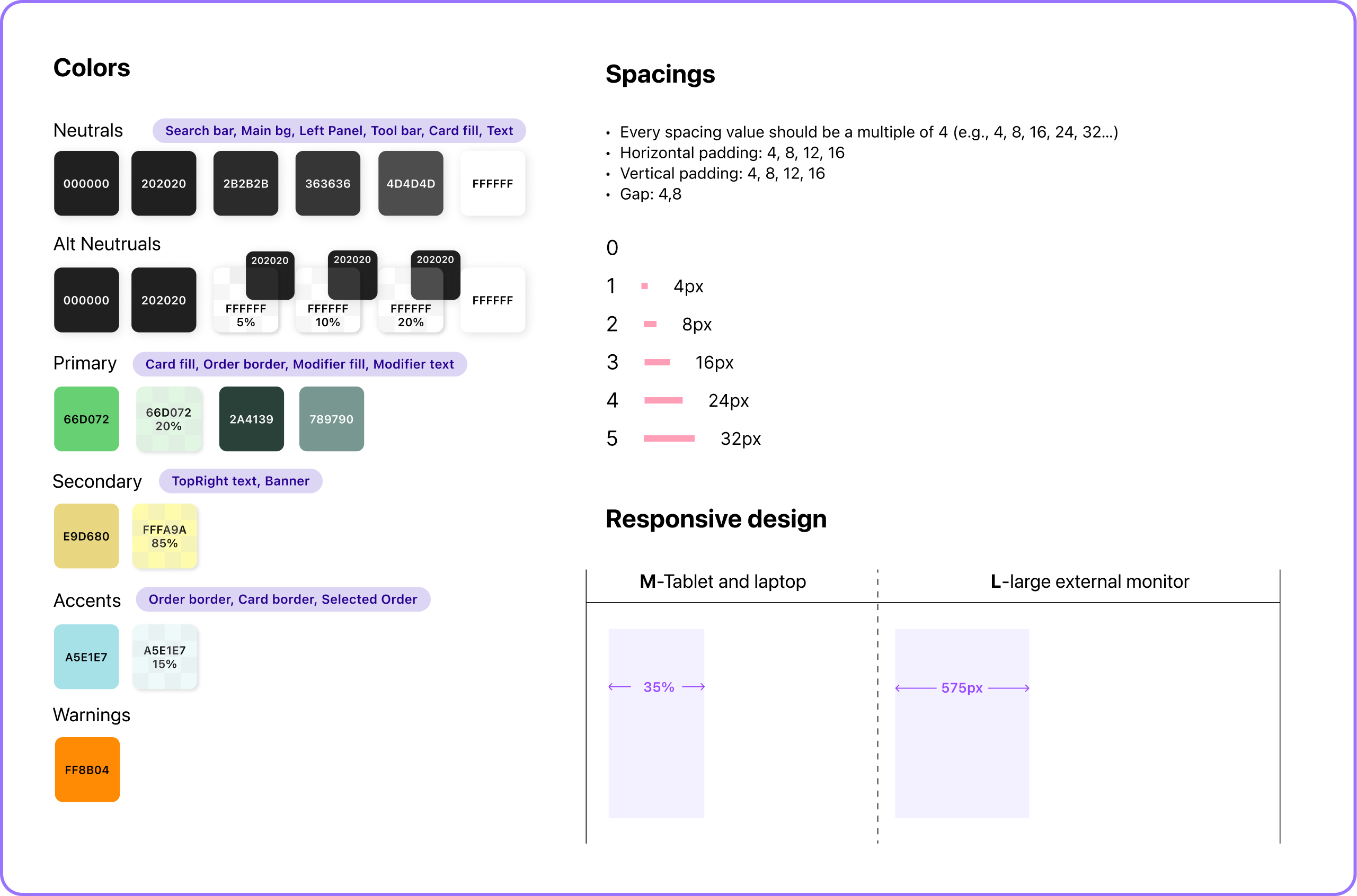
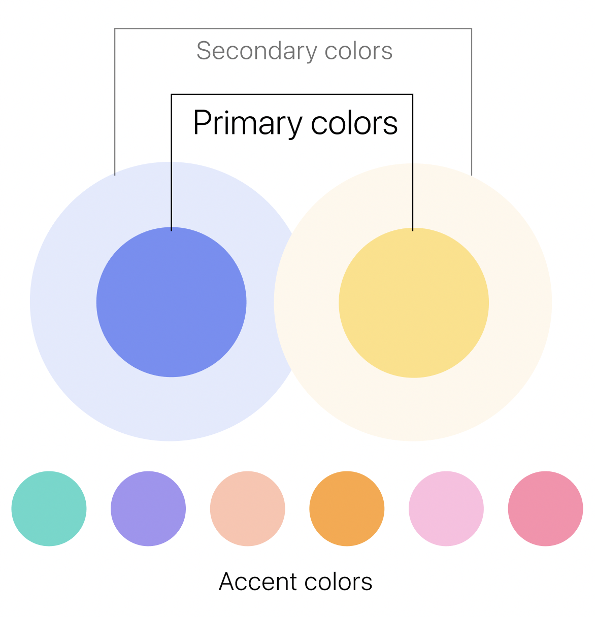
Why choose such a wide range of colors for the UI components?